What are control charts?
A control chart is a popular statistical tool for monitoring and improving quality. Originated by Walter Shewhart in 1924 for the manufacturing environment, it was later extended by W. Edward Deming to the quality improvement in all areas of an organization (a philosophy known as Total Quality Management, or TQM).
Try our control chart calculator for attributes (discrete data) and control chart calculator for variables (continuous data).
The purpose of control charts
The success of Shewhart's approach is based on the idea that no matter how well the process is designed, there exists a certain amount of nature variability in output measurements.
When the variation in process quality is due to random causes alone, the process is said to be in-control. If the process variation includes both random and special causes of variation, the process is said to be out-of-control.
The control chart is supposed to detect the presence of special causes of variation.
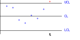
In its basic form, the control chart is a plot of some function of process measurements against time. The points that are plotted on the graph are compared to a pair of control limits. A point that exceeds the control limits signals an alarm.
An alarm signaled by a control chart may indicate that special causes of variation are present, and some action should be taken, ranging from taking a re-check sample to the stopping of a production line in order to trace and eliminate these causes. On the other hand, an alarm may be a false one, when in practice no change has occurred in the process. The design of control charts is a compromise between the risks of not detecting real changes and of false alarms.
Assumptions underlying Control Charts
The two important assumptions are:
- The measurement-function (e.g. the mean), that is used to monitor the process parameter, is distributed according to a normal distribution. In practice, if your data seem very far from meeting this assumption, try to transform them.
- Measurements are independent of each other.
Constructing a 3-sigma ("Shewhart-type") control chart
During a stable stage of the process:
- Determine the process parameter that you want to monitor (such as the process mean, or spread).
- Create the centerline of the plot, according to the target value of your monitored parameter.
- Group the process measurements into subgroups (samples) by time period. The points to be plotted on the plot, are some function of the process measurements within each subgroup, which estimate the target value.
For example, if you are monitoring your process mean, then the points on the plot should be the sample-means, computed at regular intervals. Denote the point at time t as Xt. - Create upper and lower control limits (UCL,LCL) according to the following formula:
UCL = CL + 3 s
LCL = CL - 3 s
where s is the standard deviation of Xt.
For the example above, Xt may be daily means of process measurements. If each daily sample comprises of n measurements, then the standard deviation of Xt is equal to the process standard deviation divided by the root of n.

After the control limits have been set, continue to plot the points on the graph, as a function of time. When a point exceeds the control limits, it indicates that the process is out of control, and action should be taken (of course, there is a slight chance that is is a false alarm).
An Example
To give you a feel of this statistical terminology, imagine a process that produces soap bars. The production manager wants to monitor the mean weight of soap bars produced on the line. The target value of a the weight of a single soap bar is 100 gm. It is also known that an estimate of the weight standard-deviation for a single soap bar, is 5 gm.
Daily samples of 10 bars are taken, during a stable period of the process. For each sample, the weights are recorded, and their mean/average is computed. The sample means are estimates of the process mean.
- The monitored parameter is the process mean.
- The center line in this case will be equal to 100 gm (the target).
- The points on the plot will be the sample means (where each sample consists of 10 measurements).
- The control limits are given by 100 ± 3 · 5 / root(10).
Sensitizing rules for control charts
The American Standard is based on "three-sigma" control limits (corresponding to 0.27% of false alarms), while the British Standard uses "3.09 sigma" limits (corresponding to 0.2% of false alarms). In both cases it is assumed that a normal distribution underlies the relevant estimators.
It has been shown that Shewhart-type charts are efficient in detecting medium to large shifts, but are insensitive to small shifts. One attempt to increase the power of Shewhart-type charts is by adding supplementary stopping rules based on runs. The most popular stopping rules were suggested by the "Western Electric Company" ("WECO"). These rules supplement the ordinary rule: "One point exceeds the control limits". Here are the most popular Western Electric rules:
- 2 of 3 consecutive points fall outside warning (2-sigma) limits, but within control (3-sigma) limits.
- 4 of 5 consecutive points fall beyond 1-sigma limits, but within control limits.
- 8 consecutive points fall on one side of the centerline.
An online calculator for the Western Electric Rules is available here.